Using the Accounts Page
Learn how the account page has been designed to give a clear view of your customer information, allowing you to review, edit and manage account activity from one place without unnecessary navigation.
Thought Process
When designing the individual account page, the goal was to create something that is visually clean, practical to use, and efficient for different types of staff. Rather than forcing users to move backwards and forwards between multiple pages, the account page keeps the most important actions and information together.
What we considered
- Removing or hiding extended features to reduce clutter.
- Designing screens that suit different types of users.
- Allowing users to view, add, edit and update without leaving the page.
- Reducing unnecessary navigation and keeping key actions within a few clicks.
Our reasoning / result
- A cleaner layout makes the essentials easier to find.
- The page works for staff both on the road and in the office.
- Too much back and forth becomes frustrating and wastes time.
- Important features and fields are less likely to be missed.
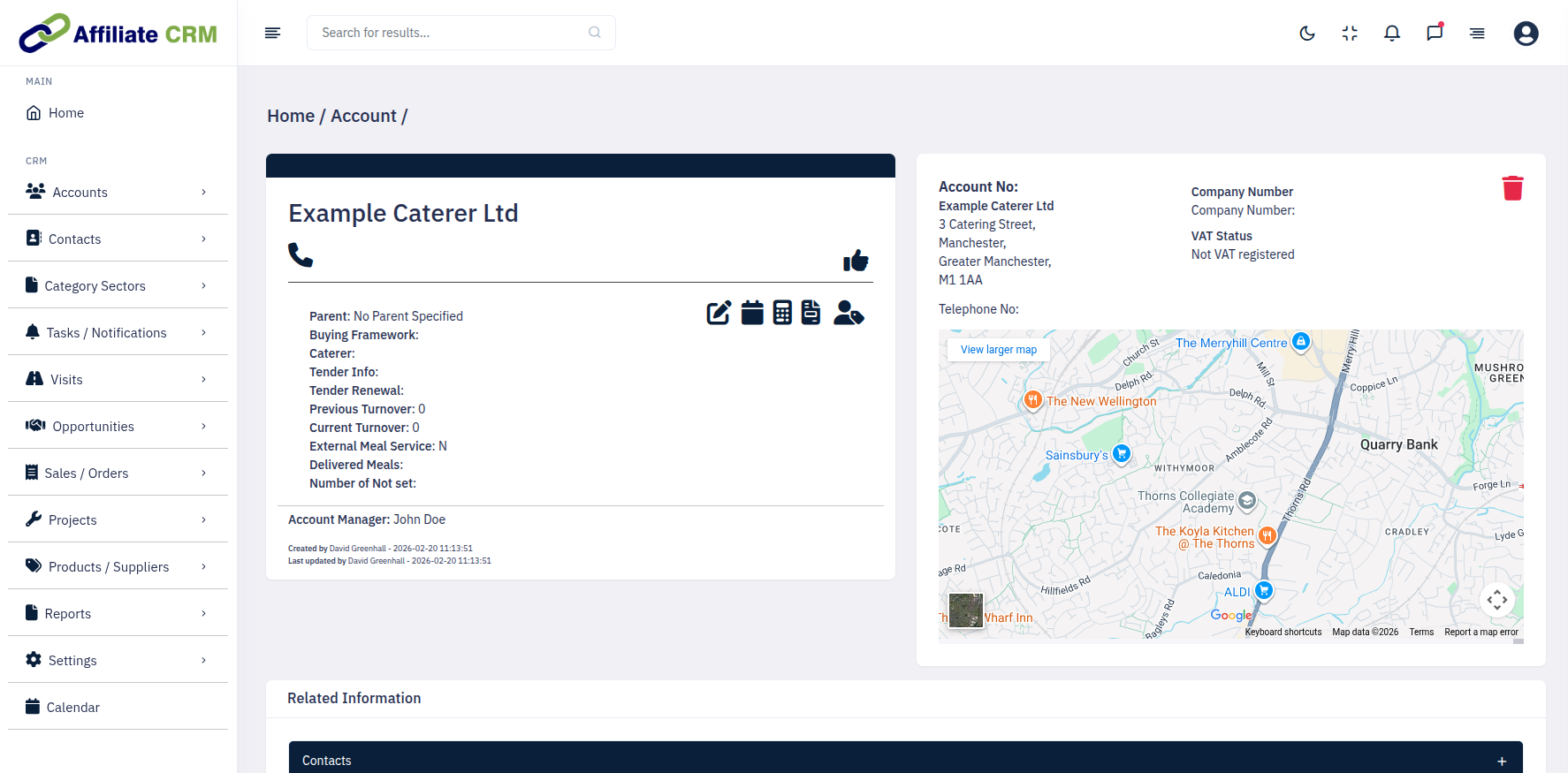
How and Why We Designed It This Way
The account page is built to give users a better working view of the account without making them chase information across multiple screens. It is intended to feel like a useful business tool, not a constant back-and-forth process.
We believe this format creates a much clearer account page, whether the user is working in the office or out on the road. Keeping the important elements together means users can review information faster, update records more confidently, and avoid missing key details.
The Three Main Areas of the Page
1. Account Window
The account window gives a simple view of the main information and adjustable fields. It is designed for easy reading and transparent access to important details such as buying history and related accounts.
Icons in this area allow information to be created, edited and viewed. Click the relevant icon, enter the details, then press submit.
2. Map
The map shows the exact location of the business, but it also works alongside the full address fields and related location details for easier viewing and copying.
This makes it simple to copy the address into an email, calendar entry or any other document when needed.
3. Accordions
Accordions allow all information relating to the account to be managed from one page. Click anywhere on the bar to expand the section and access the relevant data.
Within each accordion, information can be created, viewed or edited without needing to move away from the account page.

What This Delivers
- A cleaner and better formatted account page.
- Less clutter and better visibility of essential fields.
- Fewer clicks when reviewing or updating account information.
- A smoother experience for both office-based and field-based users.
- Faster access to business-critical information from one screen.
Getting More From the Account Page
Link related accounts
If multiple businesses are operated or owned by the same organisation, link them together and make one the main account or HQ.
Access accounts from anywhere
Accounts are directly accessible throughout the system, from visits to projects, with a simple click. If you cannot remember the account name, use the different options on the menu in the left-hand column to find it.
Assign to staff members
Assign an account to any member of staff and review when it was last updated or viewed. This is useful when moving work between teams or adjusting territories.
Use the map for quick planning
The map also allows you to click for directions, making it easy to plan routes to the account.
Use recent activity as a snapshot
The three-line recent activity view gives a quick summary in one place. For more detailed viewing or editing, simply open the relevant accordion.
Keep everything on one page
The main strength of this layout is that information does not get lost across multiple screens. Review the essentials first, then expand the sections you need.